Data Visualization is the art of organizing data into an easily understandable form. A good data visualization (or “DV”) should tell a narrative by emphasizing significant correlations or outliers that have an impact on its audience.
Recognizing the significance of data insights can help businesses with planning, strategies, and actions. Making those insights visible using appropriate visualization tools and techniques is paramount.
Exploratory Data Analysis
Data visualization has become an indispensable business tool. It allows executives to quickly grasp the big picture contained within their company’s transaction, interaction, and behavioral info and communicate that story to key members of management as well as wider public audiences with an interest in that topic area.
Effective DV requires striking a balance between form and function, according to this article. A plain graph might fail to attract anyone’s interest unless dressed up with eye-catching designs; similarly, visually stunning visualizations might convey incorrect messages or confuse audiences.
As it can be challenging to extract useful patterns or outliers without delving too deeply into the details of an info set, DV tools make this task much simpler by visually depicting trends, patterns, and outliers within it through graphs or charts. This makes the analysis of large amounts of information much faster than reading spreadsheets or reports alone.
As a result, business analysts can more quickly identify growth opportunities within their organization and make educated decisions regarding business strategy. Presenting this info visually makes its findings simpler to interpret for people from various backgrounds and expertise levels.
DVs are often employed to represent data in an easily understandable format or to demonstrate its evolution over time, such as line charts, waterfall graphs, and timelines. They may also help show the frequency of events with histograms which show how frequently an event or variable appears in sets of data.
Sometimes businesses’ data needs deeper examination for insights. DV offers the perfect way to accomplish this; presenting it in an understandable and interpretable format helps your target audience as well.
DV may seem straightforward enough for presentation to colleagues or clients, but creating an effective visual requires careful thought and consideration. You must consider your purpose for doing analysis, choose which visuals best meet it, and follow best practices when creating any type of visualization.
At the core of it all lies the accuracy, completeness, and consistency of DVs. Any discrepancies could throw off visualization and you should ensure you don’t present misleading visualizations; such errors often stem from not providing relative context but can also occur deliberately to promote particular viewpoints.
Visualization Tools
DV is the process by which designers convert large info sets into visual elements such as geographic maps, graphs, charts, and infographics that make the information easier for audiences to understand and interpret, leading to real-time actionable insights more effectively and faster than before.
There is an array of visualization tools on the market ranging from software designed for ease of use to more sophisticated platforms designed for advanced info analysis. Some stand out with their robust capabilities while others lack flexibility or user-friendliness to meet specific industry or enterprise requirements.
Consider which data source(s) and where the final visualization will be published when selecting a visualization tool. Select one that can support all your sources while offering flexibility when publishing on websites, blog posts, or online news articles. Also, take into account how large your data set is as well as whether any filtering or grouping needs to take place before rendering on screen.
Visualization Techniques
DV can be an effective way of sharing key insights with an audience – be it business stakeholders who need actionable insights from your analysis, or wider interest audiences – but you must first take careful consideration into account when selecting visualization techniques suitable for communicating findings to these audiences.
If your business collects customer retention info, a timeline visualization that depicts customer purchases over time. This type of consulting data visualization differs from others as its likelihood of churning can be very beneficial in quickly pinpointing which data points are leading to customer churn. This is especially good for helping identify patterns that could help stop future churn by making adjustments to customer experiences.
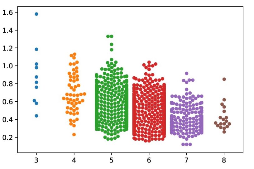
Create other types of DVs using various charts. A scatter plot chart uses dots to represent values for two distinct numeric variables, while a box-and-whisker graph displays ranges in relation to a median value. You could even create a heat map by using scatter plot charts on maps to represent your info with increasing or decreasing degrees of hotness representing higher or lower levels of value.
No matter the visual you’re creating, DV holds some universal truths that should guide its creation. Your visualization should be as clear and accessible as possible to reduce cognitive load (how much brain power it requires to process information), with your data presented in an easily understandable fashion. Strive for balance when possible while leaning toward simplicity where possible to tell the story you intend to tell.